THE HELPER OF ENTERPRISE DIGITAL TRANSFORMATION

Perceive the world and create the future
工匠精神+创新精神
CORE PRODUCT CAPABILITIES
深耕计算机视觉、语音识别、自然语言理解、人机交互等人工智能基础技术
以丰富的行业经验,深刻的行业理解和产品化能力,助力行业客户解决核心需求问题
解锁多行业场景,在城市管理、工业制造、互联网服务多行业领域实现商业落地和产业的深度融合
探索本质、执着追求,突破已有框架,引领人工智能技术的创新性发展
THE SOLUTION
SOLUTION
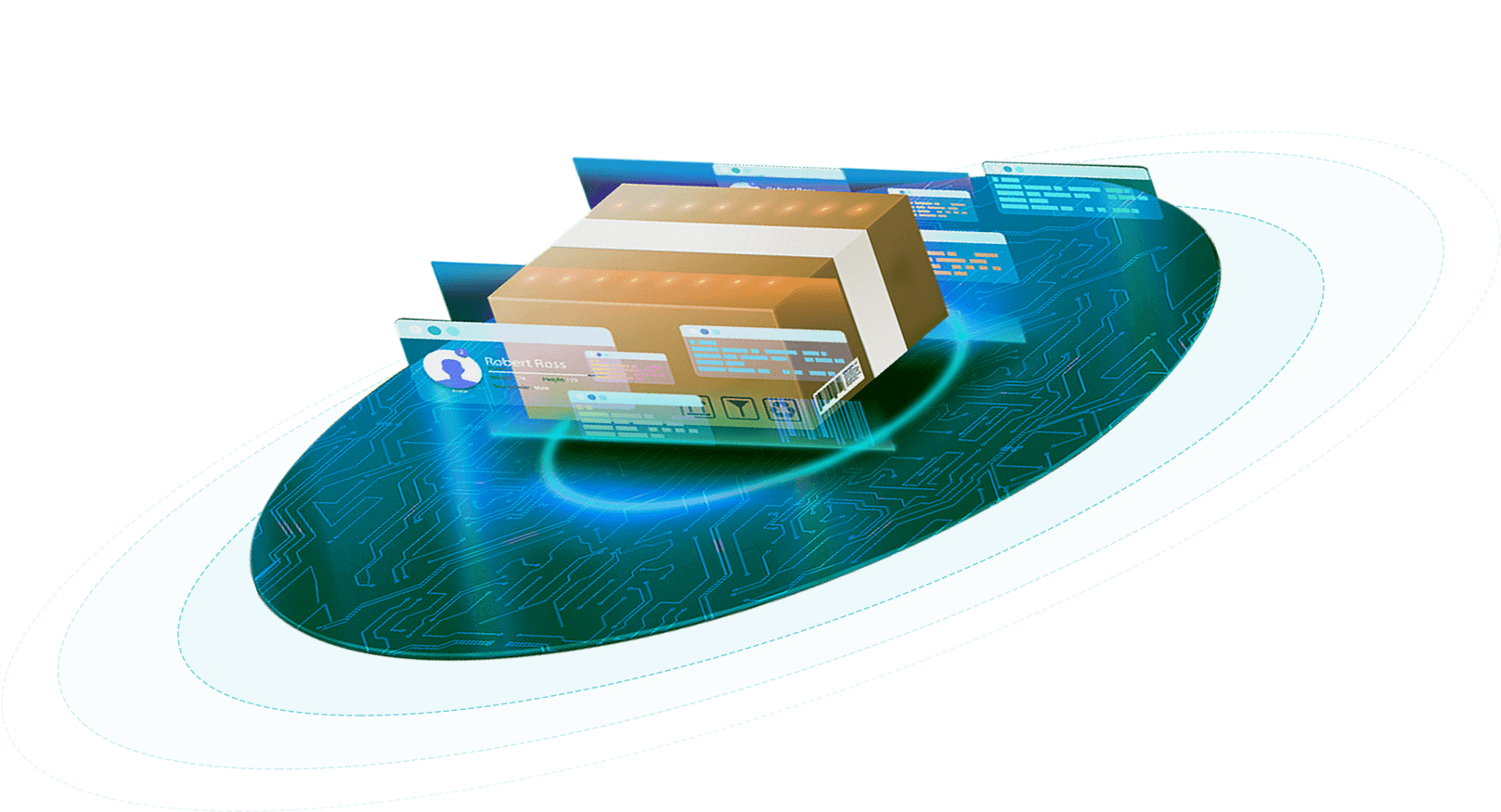
Digital Twins智慧解决方案是基于用户体验视角,通过三维建模还原实体场景,将数据和物理世界的状态同步呈现,使用户对关键数据有更直观的感受,推动各行业完成智能化转型,实现新旧动能的转换
Digital Twins智慧解决方案是基于用户体验视角,通过三维建模还原实体场景,将数据和物理世界的状态同步呈现,使用户对关键数据有更直观的感受,推动各行业完成智能化转型,实现新旧动能的转换
了解更多凭借多年来聚焦于新一代信息技术、数字化转型等领域的技术与商业模式的创新应用,有能力满足客户在网络优化、运营维护和信息安全防护等方面的需求,为客户提供安全、稳定、合规、持续的信息技术服务
凭借多年来聚焦于新一代信息技术、数字化转型等领域的技术与商业模式的创新应用,有能力满足客户在网络优化、运营维护和信息安全防护等方面的需求,为客户提供安全、稳定、合规、持续的信息技术服务
了解更多CORE PRODUCTS


WHY CHOOSE US?

行业客户
知识产权
资质荣誉